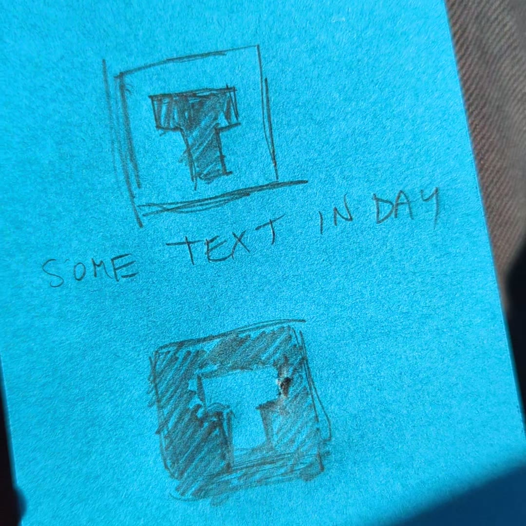
Pick day mode or night mode
One trick I found for making a website (or any design) more cohesive is to pick a day or night mode, so the clearest text shows up black on white or white on black. If all the sections of the website are in day mode, or all in night mode, the sections stick together better and look good together. It’s a weird mental trick, but it works really well.
In day mode, the text is black on a light background. In night mode, the text is white on a dark background. Just doing that simple thing has helped my clients have more cohesive websites.
Start with one clean font
I start most websites with the Montserrat font. Sometimes I’ll mix it up a little, but mostly Montserrat is really good. Some top designers only use Helvetica for everything, because it’s so useful and so flexible. I was looking for a font like Gotham, the font used on the Obama Hope poster. It’s just a super clean gothic font. Montserrat was the one that was online. It loaded fast, it was clean, and it was usable for a whole bunch of purposes.
It’s a good practice for getting to a baseline. Sometimes we get too fancy and too crazy, and it distracts from the message. So I use a very basic font to get straight to the point and let people receive the message.
More on this: good graphic design and hierarchy in design.